Brand
See how Sycamore’s brand, colors, and typography make school communication clear. Explore logo rules, color meaning, and what sets us apart. Our approach helps parents and school admins complete tasks faster—enroll, pay, and stay informed with less effort.
Schools don’t need noise. They need clarity.
The new Sycamore brand guide exists to help admins, teachers, and families finish daily tasks faster and with less friction. That means short labels, clear paths, and a visual system that stays readable during long work sessions. Paired with our upcoming press release, this post explains how our colors, type, and logo rules support that mission—and how this helps you compare Sycamore with other platforms.

Our palette balances calm greens with clean neutrals and a supporting blue. The core swatches are Green Yellow (#c1da5f), Dark Sea Green (#8eb488), Alabaster (#f2f4e9), Hooker’s Green (#5a7768), Powder Blue (#b1d7d6), and Dark Jungle Green (#1a251b). These values are standardized across print and digital to keep results consistent.
In education, green reads as growth and steadiness. The Sycamore brand guide matters on parent payment pages and admin dashboards where attention runs long. The blue note adds trust on technical screens and reports. Alabaster keeps fatigue low on dense tables and forms. The result: a UI that guides action without shouting.
How we apply it:
Color shifts between print and screens are expected. Our files are tuned so what you export aligns with what you see.
Headings use Archivo. Body copy uses Lato. The logo is set in Roboto Black and Roboto Regular. This mix is clean, familiar, and easy to skim on mobile. It helps labels and buttons feel direct while keeping paragraphs comfortable for longer reads.
In the product and on the site, we pair large, scannable headings with 16–18 px body text and generous line height. Short sentences beat dense blocks. Your team will see that tone in this post—and in our UI.
The logo works because we protect space and size. Keep at least the width of the “S” clear around it. Don’t drop below 0.25 inches or 24 pixels in height. These rules keep edges crisp in crowded layouts like nav bars and invoices.
Avoid common mistakes: no rotation, no stretching, no off-brand fonts or colors, no resizing parts, no boxed logo on busy photos, and no drop shadows. These don’ts exist to preserve recognition across portals, emails, and printed forms.
We write like we design—direct and human.
Labels use verbs you act on: Add student. Send update. Run report. In guides and announcements, we explain acronyms once and keep moving. Families and staff shouldn’t need a glossary to pay a fee or submit a form. This voice shows up across the site, in help content, and in product copy.
FACTS and Blackbaud carry broad feature sets. Sycamore aims for school-first clarity with one login that makes routine tasks fast—for families and finance teams alike. The brand choices support that goal:
When a school or group compares options, they should see the difference on the page without a demo. Our visuals make the case in seconds; the workflows confirm it.
Groups need consistency across campuses. Our palette and type system travel well, and our logo rules keep each site and portal familiar to families who move between schools. District leaders can share templates for email, fee pages, and forms so every school benefits from tested patterns. The look stays unified; the content stays local.
Start with your design system and stylesheets. Apply the palette and type pairings, then audit buttons, alerts, and form labels for contrast and size. Update login and dashboard cards, then move to PDFs, invoices, and email templates. Replace outdated screenshots in help articles and sales decks. This sequence keeps the most-used screens clean first, then lifts the rest without slowing daily work.
We aim for strong contrast ratios, especially on forms and tables. Dark Jungle Green on Alabaster works well for body text, while Green Yellow should stay on larger elements like buttons and highlights, not small text. These choices keep the interface readable in low-light labs and busy front offices.
We’re sharing this guide alongside our brand and leadership news so schools and groups can see how the look supports the product you use every day. The choice of green, the type pairing, and the logo rules aren’t simply decorative. They are part of how Sycamore helps you work faster and communicate with confidence. Colors, fonts, and logo usage come straight from the Sycamore Brand Guidelines.
From Brazil to Rwanda, mission-driven international schools are ditching manual spreadsheets for a centralized Student Information System. Discover how Amazon Valley Academy and Virunga Valley Academy are leveraging Sycamore to reduce administrative friction, support diverse grading models, and enhance parent engagement through real-time mobile access.
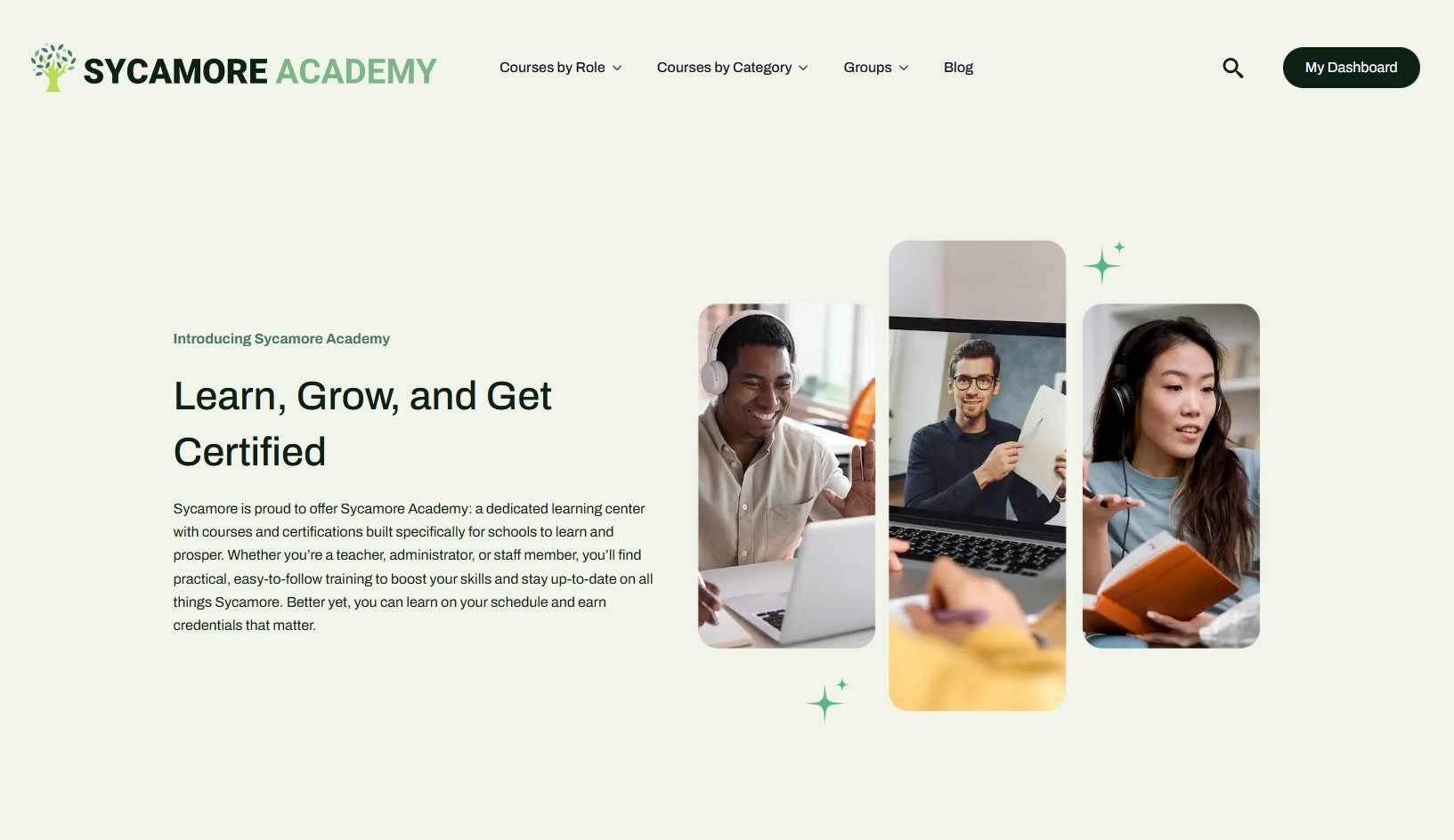
Sycamore Leaf Solutions has launched Sycamore Academy, a new role-based training and enablement hub for administrators, teachers, and parents. The platform debuts with 37 courses, 417 lessons, 882 topics, and 27 quizzes—plus continual updates, expanded pathways by spring 2026, and planned future certifications to help schools onboard faster and build confident power users.
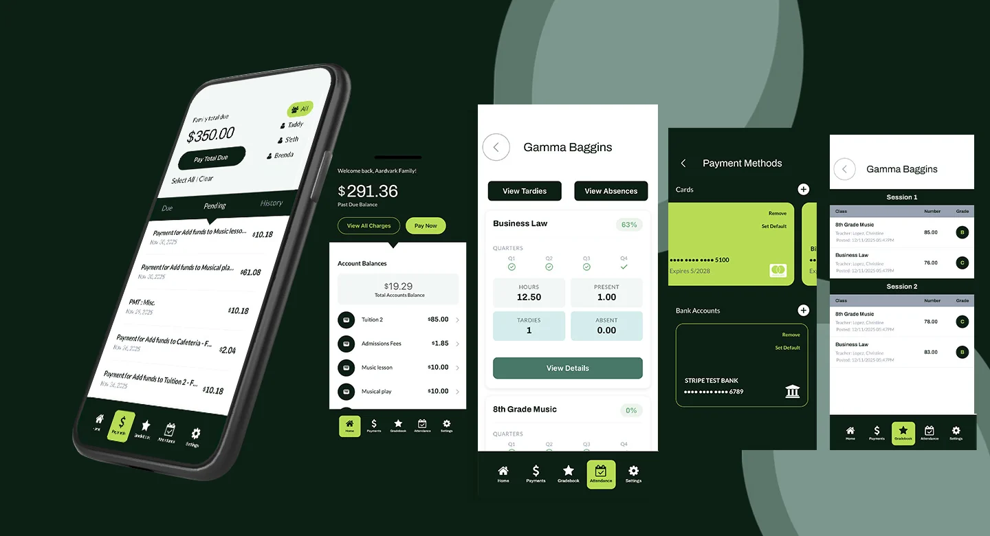
The Sycamore Parent App brings payments, attendance, and grades to your phone. Built for K–12 schools, with role-based access and smart notifications.